~/contents
This post chronicles a week-long challenge to port Katharine Turner’s The Bogey to Android so I could play it on my phone while waiting in line in my car at the school. The last time I made an app I set myself a time limit of one week. That worked really well and helped manage scope creep, so let’s do it again!
10/15 Rapid Prototype
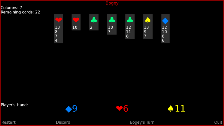
 I was able to whip up a quick prototype in Ren’Py, it works great and Ren’Py makes .apk creation a breeze, however it is 14 MB.
10/16 Planning Ahead

After tidying up the code into two Classes and playing a few rounds I decided to add some basic loss condition logic. There was a question of how much I really wanted to try to automate the game flow, I wanted to err on the side of less.
- 1 If the player starts a 12th stack and all 4 Aces aren’t on the Table the game cannot be won. This is easy to check.
- 2 Slightly more complex is to see if the Bogey’s hand can be played. To do this, we first check to see if there are less than 12 stacks, then check to see if the existing stacks for the suit accomodate the value.
The third loss condition is if there are no longer playable cards in the deck or current hand. One thing I learned looking into solitaire card apps for my own use is users are HIGHLY suspicous of apps cheating. So I wouldn’t want the app to declare a loss on cards the player cannot see. That means the third condition would not be checked until the player has reduced the deck to the cards in-hand. It’s not as useful as the other two checks so I put it off for now.
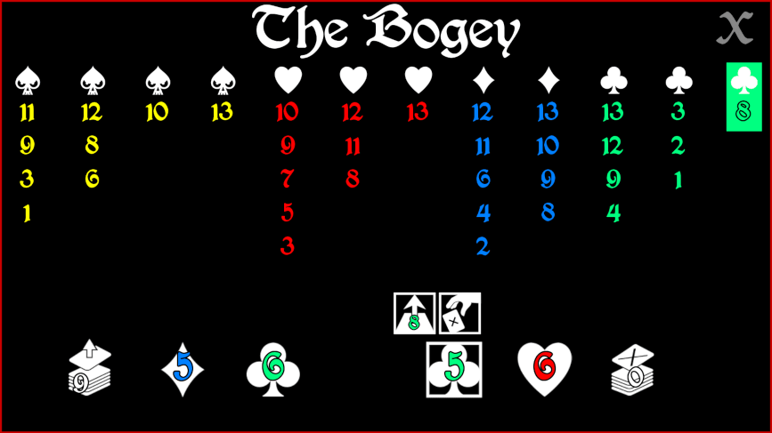
Now we have a fully-functional prototype with a somewhat clunky layout.
10/17 Refine Layout, Add Theme
 After waffling between porting elsewhere or using Ren’Py, I decided to stick with Ren’Py, which gives me a ton of GUI flexibility.
First thing is the layout, which is clunky af. Elements need to remain static (currently they move around depending on things like list size) and be placed in a way that is convenient for touch controls. A new stack is started by a double-tap, essentially, and otherwise the card is selected and the stack is chosen. Text is replaced with icons from game-icons.net.
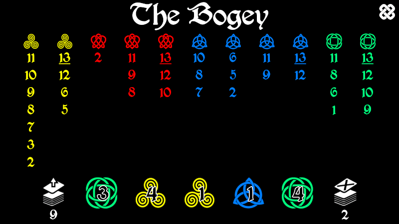
There has been some confusion about what the heck a Bogey is, but it’s a fey creature of some sort and I decided to go with Celtic-knot style aesthetic. I was having trouble finding decent resources but openclipart saved my bacon on this one, and I was able to find 4 Celtic-like symbols that will work for suit replacements.

The next step will be to either implement animations or allow the player to use drags, which would mean I needed less animation. I am not convinced adding drags necessary makes the app better.
10/18 - A few tiny bells and a lot of testing
After adding rudimentary score storage I found myself needing to chase down a few bugs, including a very perplexing one I could not explain where Nones were being inserted into the current_hand, which should only have card objects. I ended up simplifying the mechanism (back to add/remove list rather than flagging the card for later removal) and that seems to resolve it.
Unfortunately the Celtic font I found, which I otherwise really like, produces a very strange letter “w” and every time the win screen comes up it annoys me. Since my goal is to make the app language-independent that may not be an issue by the end of the week.
Lots of testing with a 15-card deck helped me chase down the last few bugs and I tried lots of irrational things like discarding when the game was clearly won, and so on. I felt reasonably confident the gameplay was solid at that point.
Next, organize score data stucture to strictly necessary data - date, columns, cards remaining - so it is more straightforward to obtain stats. I got lost in scoreboard design and styling for way too long.
10/19 - Updates
- Fixed bugs that caused game to crash under certain parameters on last hand
- Fixed scoring bug where game was prematurely declared a win on last hand
- Updated scoring screen to implement scoring icons and use less language
- Simplfied scoring data structure
- Added basic fade animations
10/20 - Updates
Marlin offered to make music. I added a placeholder in the meantime.
- Added android apk icon
- Implemented difficulty setting (4 or 5 card) and seamless switching between the two.
- Created new game icons / difficulty switching icons
- Fixed bug where game will crash if action menu is open while switching difficulty setting
- Added placeholder soundtrack
- Added music mute toggle
- Redesigned help screen, reducing words and adding (many, many) icons
- Added presplash
- Added (gentle) loss condition notification.
10/21 - Last Day!
And I woke up before the crack of dawn thinking, who needs sleep, and who needs gainful employment, when you have arbitrary app challenges?!
Two big ideas I’ve been putting off because they are more complex. The first is a function that reads the final hand and determines if the game can be won. It’s more involved than the regular loss condition check because the player might have cards that play off each other. The second is a way to undo the last move, which was something I wish I had when I made a few dumb taps while testing.
- 1, check the stacks, then check any apparently unplayable card to see if there is a card in-hand that has +1 value.
- 2, for undo, implement per hand drawn. since order matters, it is a list. if undo active, pull the last item from the list, perform the reverse action.
Up until now I’d been fudging the action bar positioning, I wasn’t sure how to get it to center up. It was important to me the action bar be centered over the selected card and I wanted a perfect mathmatical solution but I was never quite able to get that. I got something reasonably close with trial and error, and the best explanation I have is there must be some tiny amount of spacing in a style somewhere I’m not accounting for. But rest assured I spent WAY too much time getting as far as I did.
After that, decided to knock out as much stuff on my bug list as possible.
- implemented undo for current hand
- implemented loss condition checking for final hand… i think. this one is tricky to test.
- fixed ? action bar alignment
- fixed mute icon toggle issue (part of issue was focus mask wasn’t disabled, added persistent to track muting since i could not find baked-in variable)
- implement quit with android back button
- fixed scoring bug
WHEW. Deployed to phone and tablet, phone promptly crashes (hooray). Tablet crashed later, also hooray because I caught the bug. I formally consider it done. …But of course it’s never done, now what?
- The app is 47 MB installed, containing 16 MB of temp data. Yes, it’s that old chestnut, application size. Once I remove all the extraneous files I have scattered around, the game has 0.6MB graphics, 3.5MB sound, 250kb fonts. These can and will be compressed.
- Colorblind pallete(s)
- Check on web implementation, I had trouble with Ren’PyWeb on my Desktop but the filesize is about 16.5MB.
- add credits page
- work on resolution issues (looks ok on tablet but less good on smaller screens, letterboxing)
- work on a consistent game pause mechanism
Aaand that should be it, thankfully.
