A few days ago I started a PNP blog on BGG. I’d been dragging my feet on starting a PNP Geeklist for well over a year. The Geeklist format is great for long lists of board games but not for ongoing discussion of groups of games or having multiple posts on the same game. BGG blog functionality isn’t great, and I’ve already lost a post and had to rewrite it (my second, wheee), but since the vast majority of the files I’m working with originate on BGG and many of the developers are active there and subscribe to the game tags it makes sense to post there.
I haven’t decided how much overlap there will be between my site and the BGG blog, I don’t necessarily want to have duplicate posts on two platforms, but I will definitely be posting my Nandeck snippets and longer ramblings here for my presonal reference and probably reserve the more succinct build notes and gameplay impressions for BGG and the general PNP audience.
Anyway, the on to the post. Spoiler alert, this one is worth your attention.
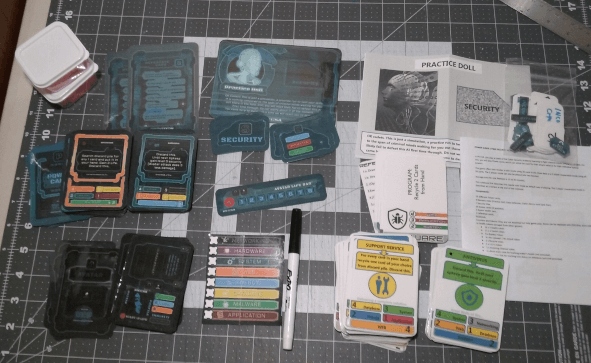
Aleksandar Saranac’s Power Surge: Cyber Security Academy is a somewhat obscure game that ended up on my list after I saw recommendations from several 1PGers and comparisons to Aeon’s End. My impression is this was a tight solo-coop deckbuilder that flew under the radar, mostly because of the utilitarian card design and the fact it’s a larger PNP build that has some formatting oddities.
The game has cards, tokens, and mats, and many are formatted with the fronts and backs side-to-side, rather than on adjacent sheets. There are also some irregularly-shaped security tiles. The good news is there is a low-ink version, the bad news is both versions of the cards use lots of color blocks and the darker colors make the black text difficult to read.
The first change I made was reformatting the security tiles into a sheet of mini-cards.
The power cards are busy, as each has a title, a special action, flavor text, and then a series of boxes alluding to the card’s power and environment types. The 8 power types (hardware, web, database, energy, networking, system, malware, application) are color coded, but some of the colors are similar to my eye (a tan and a gray). Assigning colored icons and using a broader range of colors would help, and of course the text needs to have white outlines so it stands out better. The power cards also have individual color-coding that corresponds to its highest power stat. For clarity, I think it might make more sense for the card to be color-coded based on the main power type, but that’s a big change I’m hesitant to make as I’ve only played with the cards once so far and I gotta trust this design choice was made based on playtesting. For now, I think incorporating icons and making the text more legible will go a long way.
The avatar cards display a programming effect when turned sideways and have an immunity as well as security values. Originally the rectangular bypass tokens were used to mark security that had been bypassed, but if we used icons or color-coded circles we could switch to cubes. All avatars have 8 health, so you could maaaybe incorporate a bar here but I think it would be best to color-code the cards based on the immunity and focus on making the security and programming effects more legible.
The Nemesis mats have setup and tactics information on one side, and the other has a title, picture, a place to put a security tile, and flavor text. I think it would be more useful to move the flavor text to the backside and add a health track to the front, since as a soloist the Nemesis will always have the base HP, which is either 10 or 20.
I use currently Nandeck for my rethemes and moving all this data to a spreadsheet will take a little time so I am gonna sit on these ideas for the moment.
Avatar Cards
This day’s Nandeck puzzle was figuring out a good way to link HTML color with a keyword. For instance, Application should always be red, and I’d like to only have to store the HTML color hex in one place so I can easily change it. I could fudge it and just make a color bar .png, but the problem is I have to manually edit the images any time I want to change the color.
I ended up going with HTMLFONT. Outlines aren’t quite as sharp on HTMLTEXT as they are on TEXT. This is my minimalist low-ink verison of the Avatar cards for people who play games in dark rooms late at night when their eyes are tired (read: me).
LINK = avatarcards.ods [all]=1-8 [titlefont]="Venus Rising" [bodyfont]="Gin"BORDER=RECTANGLE DPI=300 UNIT=MM PAGE=210,297,PORTRAIT,HV CARDSIZE=63,88 MARGINS=1.5,1.5,1.5,1.5
‘Cutting Guides and removing borders BORDER=RECTANGLE,#000000,0.1,MARKDOT,#0000FF FONT=Arial,128,,#000000 EDGE=1,NULL
FONT=[bodyfont],16,TF,#000000 TEXT=[all],“PROGRAM:\13[Programming]",15%,5%,75%,50%,CENTER,WWCENTER,-90
[securityfontsize]=9 HTMLFONT=Databasefont,[titlefont],[securityfontsize],AR,#ffffff,CENTER,0,0,0,,#000000,0.2,0,#e1ec00 htmlfont=Energyfont,[titlefont],[securityfontsize],AR,#FFFFFF,CENTER,0,0,0,,#000000,0.2,0,#0917dd HTMLFONT=Hardwarefont,[titlefont],[securityfontsize],AR,#FFFFFF,CENTER,0,0,0,,#000000,0.2,0,#b8b8b8 HTMLFONT=Webfont,[titlefont],[securityfontsize],AR,#FFFFFF,CENTER,0,0,0,,#000000,0.2,0,#e57e00 HTMLFONT=Networkingfont,[titlefont],[securityfontsize],AR,#FFFFFF,CENTER,0,0,0,,#000000,0.2,0,#666262 HTMLFONT=Applicationfont,[titlefont],[securityfontsize],AR,#FFFFFF,CENTER,0,0,0,,#000000,0.2,0,#a80a0a HTMLFONT=Systemfont,[titlefont],[securityfontsize],AR,#FFFFFF,CENTER,0,0,0,,#000000,0.2,0,#16bb09 HTMLFONT=Malwarefont,[titlefont],[securityfontsize],AR,#FFFFFF,CENTER,0,0,0,,#000000,0.2,0,#a0bd9d
FONT=[bodyfont],14,TF,#000000
HTMLTEXT=[all],"[Value4]",50%,66%,53%,10%,#FFFFFF,0,FE,100,"[Value4]font” IMAGE=[all],“icons/4.png”,40%,62%,12%,12%,0,NAP
HTMLTEXT=[all],"[Value3]",50%,73%,53%,10%,#FFFFFF,0,FE,100,"[Value3]font" IMAGE=[all],“icons/3.png”,40%,69%,12%,12%,0,NAP
HTMLTEXT=[all],"[Value2]",50%,80%,53%,10%,#FFFFFF,0,FE,100,"[Value2]font" IMAGE=[all],“icons/2.png”,40%,76%,12%,12%,0,NAP
RECTANGLE=[all],0%,90%,100%,10%,[Color],[Color],1 FONT=[titlefont],20,TF,#FFFFFF TEXT=[all],[Avatar],5%,90%,90%,10%,CENTER,WWCENTER,0,100,1 FONT=[titlefont],20,TF,#000000 TEXT=[all],[Avatar],5%,90%,90%,10%,CENTER,WWCENTER,0,100
IMAGE=[all],“icons[Avatar].png”,5%,57%,35%,35%,0,PAN
Aaaand while researching this I discovered Andrea has linked game-icons.net to Nandeck. I use game-icons A LOT so yay.
- https://boardgamegeek.com/thread/2081723/using-icons-game-iconsnet
- https://boardgamegeek.com/thread/2248297/lookup-table-icons
Final Build
While I was sorting all this out the developer offered me the redesign files, so I printed those out instead. They are much fancier than whatever I cobbled together. This is my usual double-sided index, laminated. The laminate does a great job of coating the darker ink.
This game I began to notice an issue where all my double-sided sheets were misaligned, some glaringly so. I just switched to a new ream of index stock (same brand and weight, but you know how that goes), and I’m not sure if it’s the printer or the paper or both. I will be keeping an eye on it. I have a couple of ideas for fixing it, including manually feeding the pages for the second side or printing on two sheets and gluing, and I hate BOTH of these ideas, so I’m hoping this is some sort of basic issue easily remedied because I have grown accusomed to printing double-sided sheets that are more or less aligned and I have ZERO interest in extra work on a laminate build thanks bye.
The Game
tldr: I like it! I expect to be playing this one for a bit.